Sought + Found
Empowering small businesses through mercantile enterprise
Project Type: Brand Identity
Agency: Nicely Built
Designer: Neil Shastri
Tools: Adobe Illustrator, Procreate, and Shopify
Sought + Found is a local mercantile business in Marietta, GA that supports small businesses around the world through the curation and selling of quality home decor. In 2021, Sought + Found made the decision to increase its social presence and global outreach by moving its business online to Shopify. As part of this effort, Nicely Built, the agency I worked for at this time, was hired to redesign Sought + Found's brand identity.
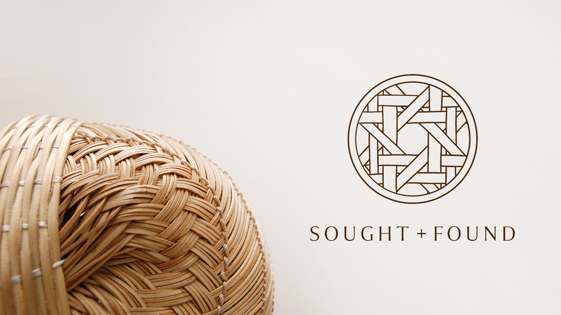
Sought + Found co-founders, Jeff Arnold & Richard Kline, requested that we bring a personal touch to their new brand identity - stating that their old logo was confusing and ineffectual. we began to explore solutions for how to incorporate visual elements that were meaningful to them. Through the use of brand questionnaires and client discovery interviews, we learned that Jeff & Richard's favorite furniture & decor pieces utilize the ancient furniture-making method, wicker. Using Procreate for the iPad, we developed a hand-drawn wicker pattern that we were successfully able to feature as the primary brandmark for the new Sought + Found visual identity.

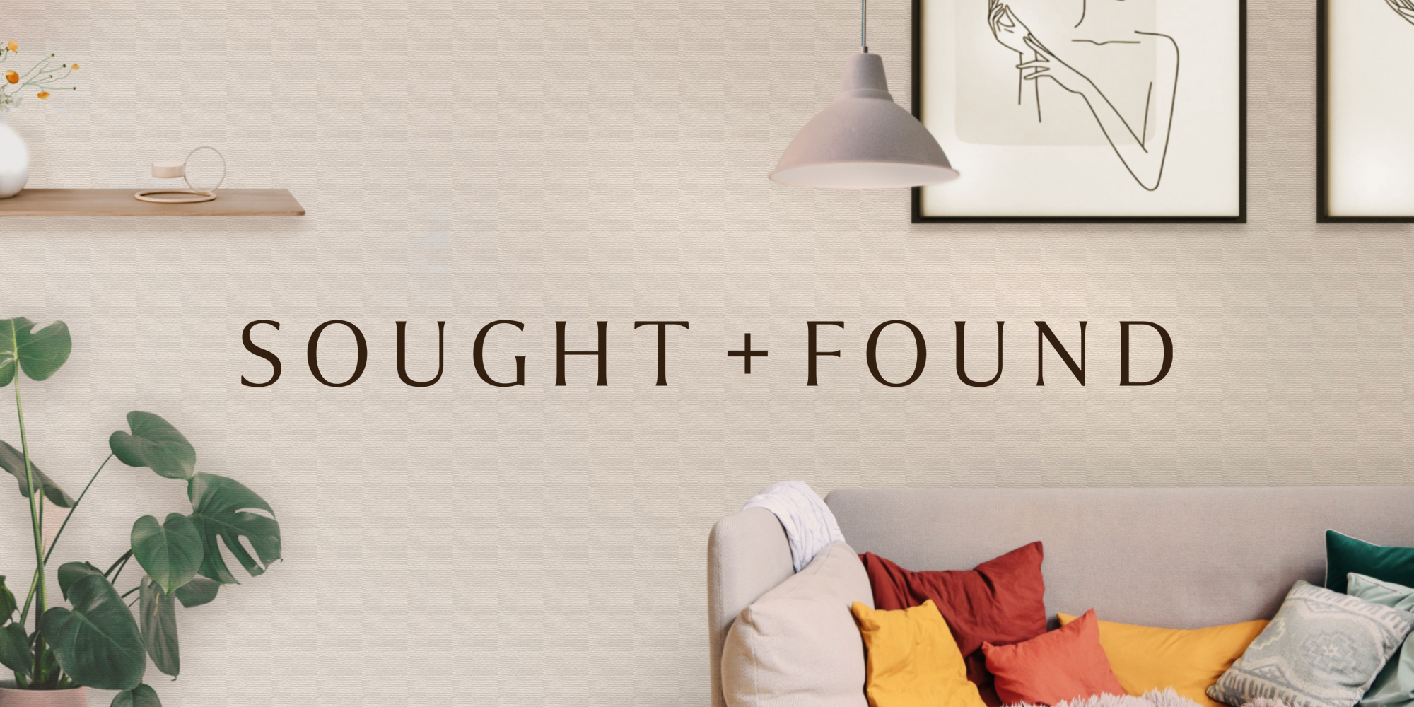
This new and improved visual identity also features a logotype that can be used with or without the Sought + Found wicker brandmark. For instances where space is limited, like on a website page header, dropping the brandmark and utilizing the logotype by itself maximizes the space and functionality of the webpage. With the lighter font weight and subtle serif characteristics, the logotype communicates to site visitors and shoppers that Sought + Found is a merchant that exudes excellence and elegance.
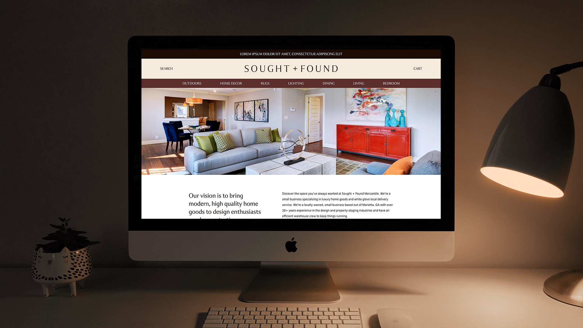
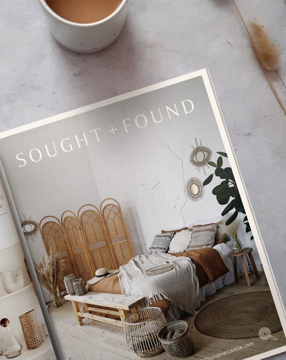
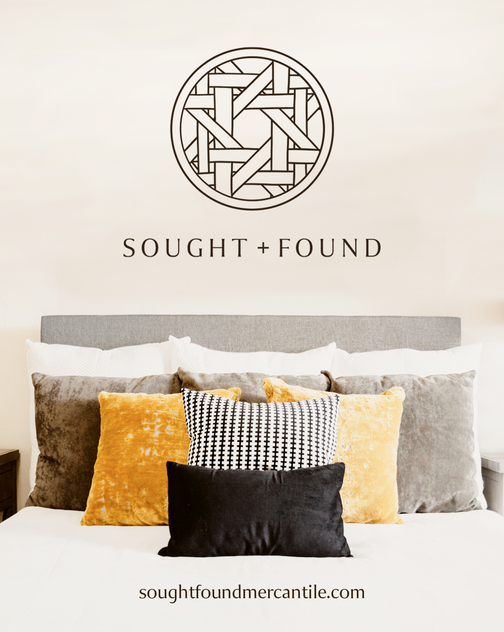
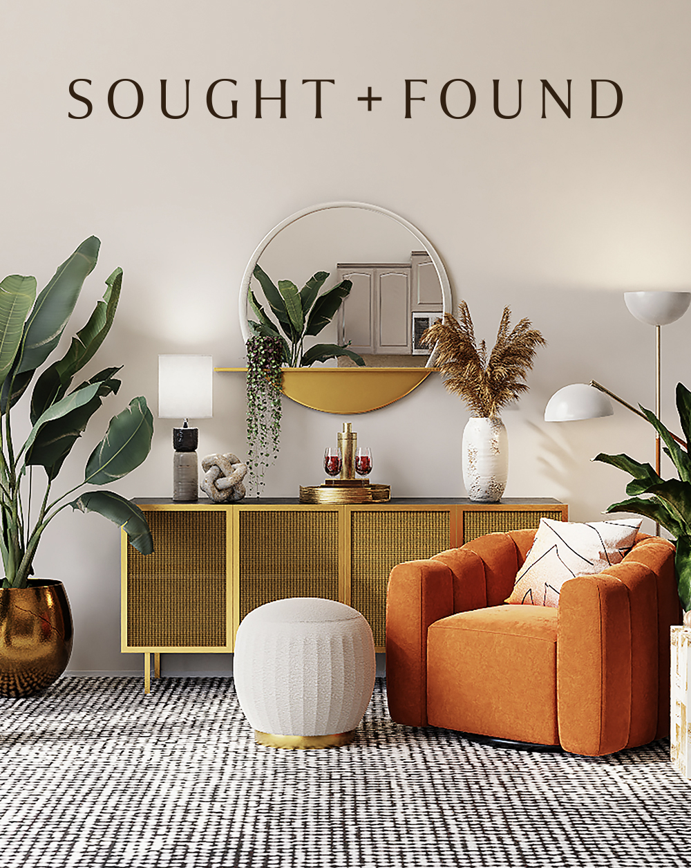
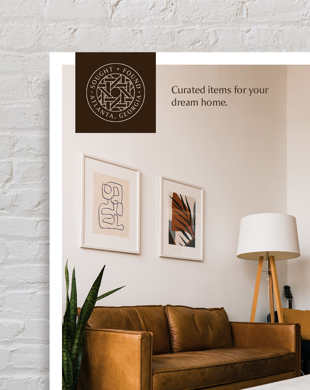

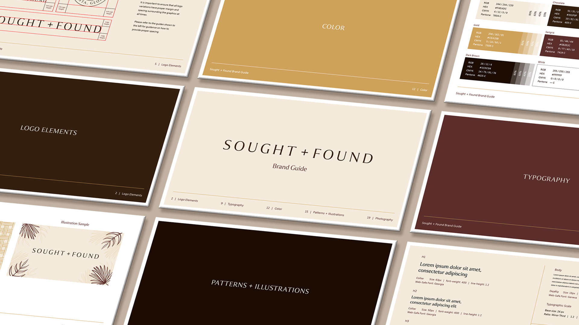
When developing a new color scheme for the Sought + Found brand, we discovered that when connecting to customers, the owners wanted their customers to feel a warm welcome in a down-to-earth and comfortable atmosphere. In an effort to achieve this, we chose soothing creams, browns to evoke a sense of security and gentle warmth, and a soft gold to subtly implicate the sophistication and elegance of the brand's intentionally curated product inventory.
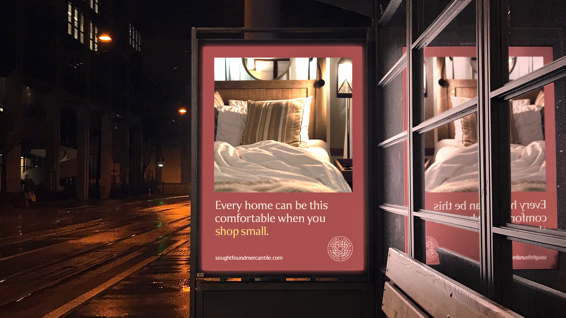
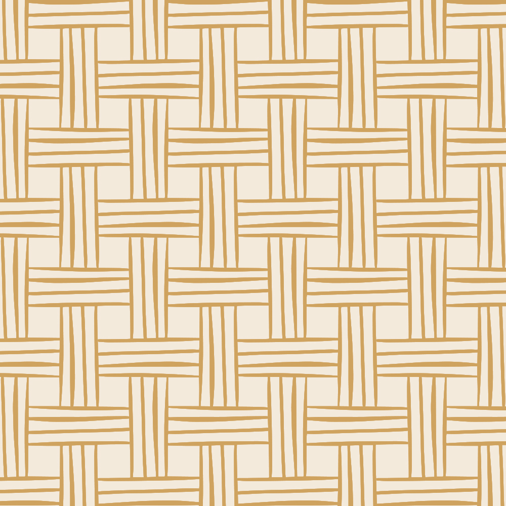
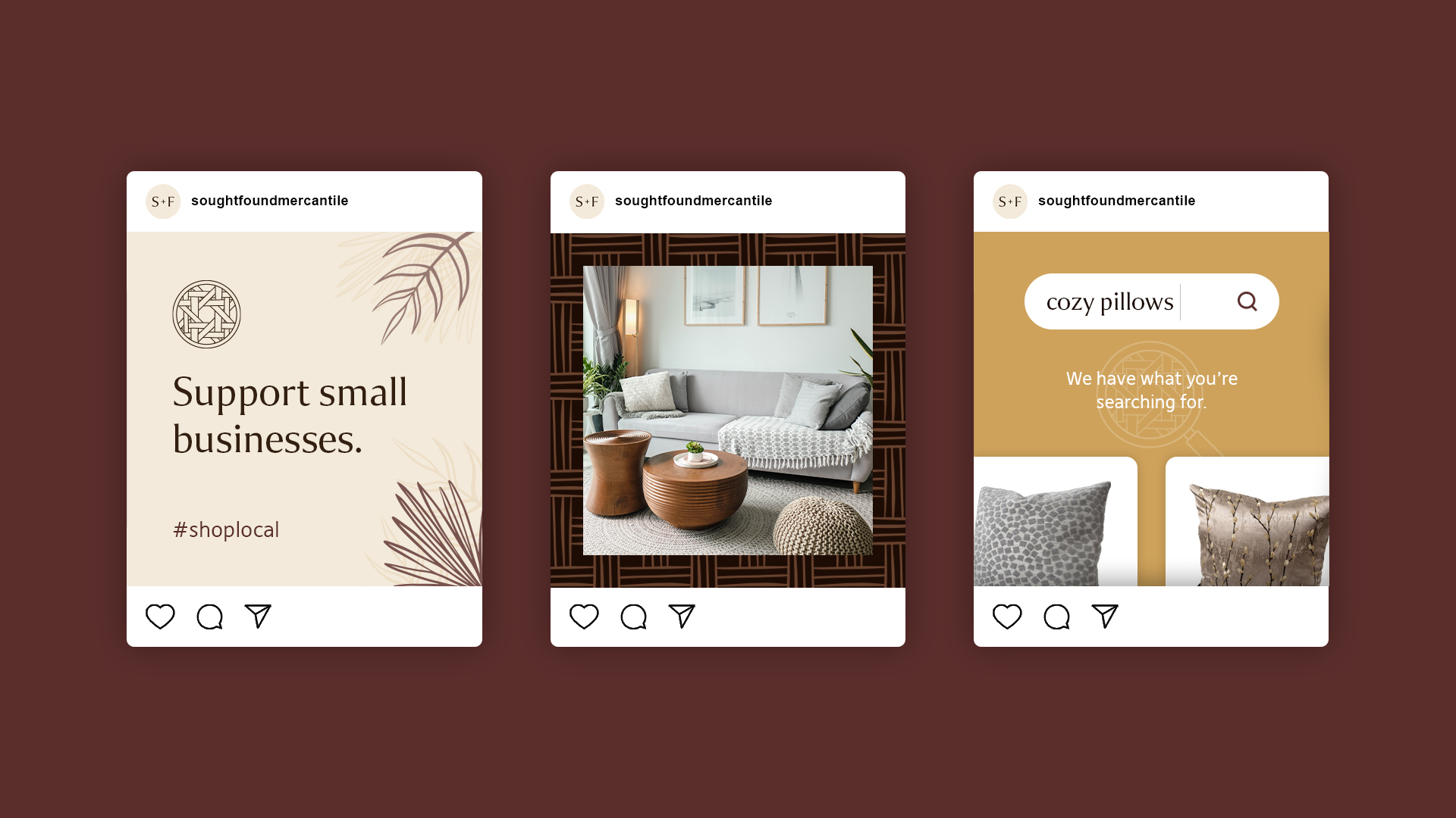
Custom hand-drawn patterns and illustrations were also created to match the style of the Sought + Found brandmark. A wicker pattern was hand-drawn for the purpose of providing backdrops to photos or social media posts. We also created custom plant drawings, inspired by the large decorative plants that tend to occupy many of the spaces in our homes and offices. These patterns and illustrations provide an extra layer of depth for digital and print brand materials.

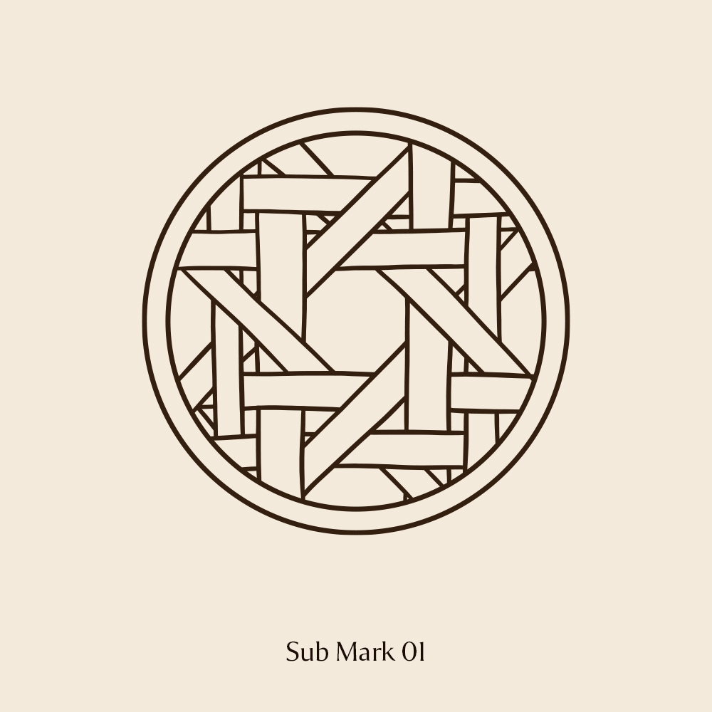
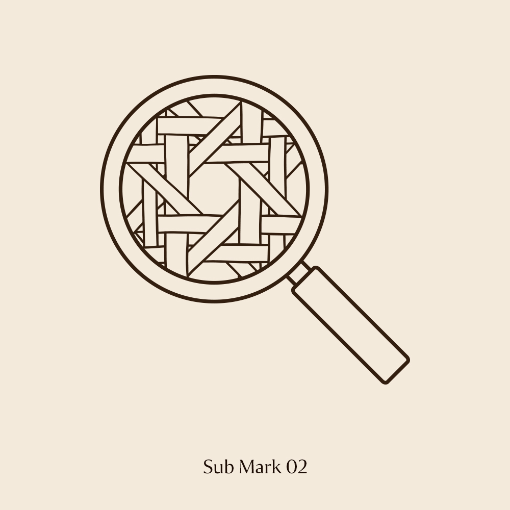
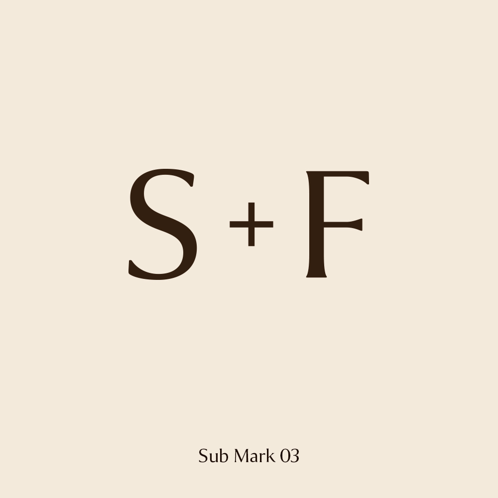
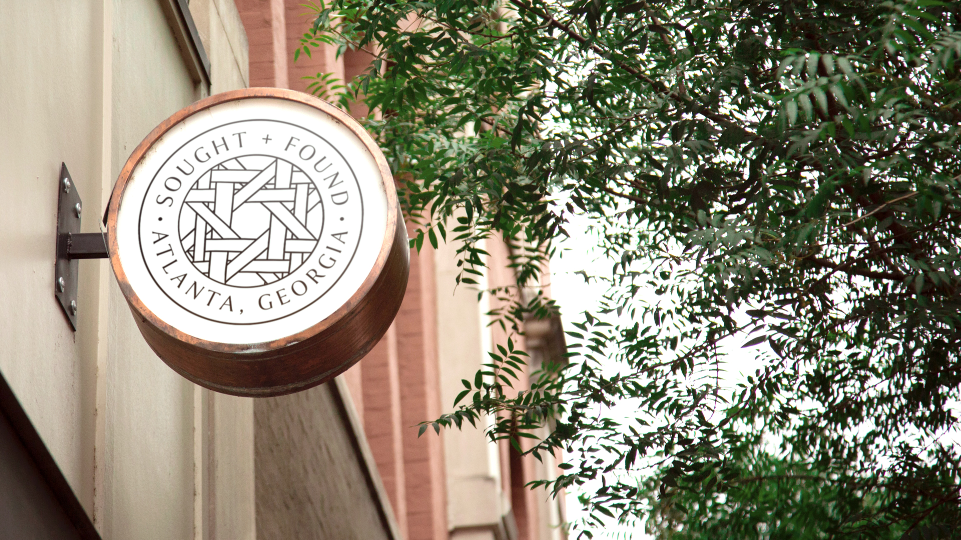
Using the custom hand-drawn wicker brandmark and the logotype, we created Submarks to be used as iconography for the Sought + Found brand. The purpose of these Sub Marks is to provide versatility for the variety of instances where the primary logo is too large for the space it will occupy. These Sub Marks can be used for brand materials like social media profile photos, background elements in brand graphics, and reduced scale logo placements for smaller ads and graphics.
Contact
Atlanta | St. Louis | Minneapolis
neil@neilshastri.design
"Storytelling is the most powerful way to put ideas into the world today."
-Robert McKee
© Neil Shastri 2024
Art Director / Senior Designer / Creative Producer